Selecting a Gridview Layout
About this task
Gridview layout options are available when creating a new app, form, or page. In each case, the options for dividing the viewable space are the same.
Note: When creating a new app, the Gridview layout applies to
the default page.
Note: You can not place a Gridview layout within another
Gridview layout.
Procedure
-
From the dialog window for a new app, form, or page, select from the available
options to divide its workspace.
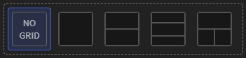 Notice: For the available Gridview / Page Layouts options, you can later change all except the No Grid option. If you choose No Grid and decide later you want to change the layout, use the Layout Widget.
 - Complete the required fields for the app, form, or page. Select Save and Continue if this is a new app or Add if you are adding a new page or form.
- Open the page or form that has the Gridview layout.
- Enter an ID and Name for the Gridview layout, or keep the defaults.
-
From the Container section, adjust its properties as
required:
Table 1. Gridview Container Properties Presets Sets the number and arrangement of the panels.
Show Border On Device Turn on to make the grid's borders visible during runtime. Layout Move the internal borders of the Gridview layout to suit the contents and requirements of each area. Fill Select a background fill option for the Gridview:  Color—Select a color from the
Color palette to use as the
grid's background.
Color—Select a color from the
Color palette to use as the
grid's background. Image—Select Upload
Image to import a graphic as the grid's
background. From Scale,
select a display option for the image:
Image—Select Upload
Image to import a graphic as the grid's
background. From Scale,
select a display option for the image:- Fit
- Fill
- Stretch
- Tile
- Center
Select Reset to remove all background choices.
- Optional:
Add a visibility rule.
Use visibility rules to control when the Gridview is visible to the app user. For example, you can create a condition that the Gridview only appears after the app user fills in a field or submits a form.
- Select Visibility Rule to open the Set Visibility Rule dialog box.
- Select whether the visibility rule requires meeting all or any conditions.
- From the Field list, select an app field or variable and an operator. Enter the value required for the Gridview to be visible.
- Select Add Condition to add another condition.
- Select Save.
- Move to the Format tab to customize the Gridview's appearance.
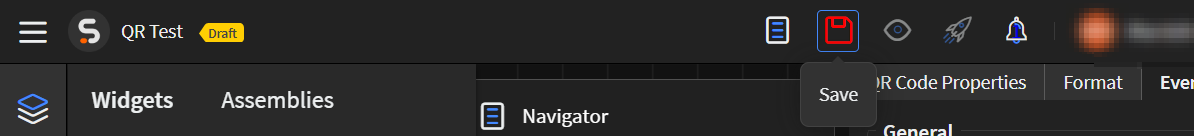
-
Select Save in the SOTI Snap
banner to apply your changes.
Results
Tip: Select Preview to see how the Gridview appears in your
app.